marnanel
291
4
0
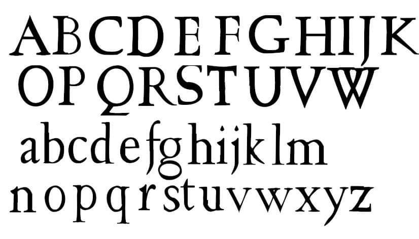
Most of the alphabet, caps and lowercase. Every few years I go back to it and improve it a bit.

Sketches of the letters on a pad of paper. Illegible (to other people) notes around them

Part of the introduction to "The Napoleon of Notting Hill" as a demo.
lemonbeagle
I like it a lot! I’m no expert, but it pleases me. I personally like that the a is a little taller. It provides nice movement for the eye.
ILovedUnicornsFirst
The ‘a’ is too tall. And some letters like ‘T’ and ‘W’ are a little thick. It’s really nice though! I had to recreate fonts in typography and I found it so tedious and mind numbing! But it’s definitely a labor of love and art form for sure. Beautiful work!
marnanel
Thank you! I'll go back and look at those. This is very encouraging.